
Overview
YooMoney (formerly Yandex.Money) is a major player in the digital payments market. My work focused on enhancing the B2B experience within the YooMoney ecosystem. I designed a comprehensive merchant dashboard for tracking business performance and developed a modular UI Kit for the platform’s educational and informational content. The goal was to make complex financial data accessible and create a unified visual language for all business-facing communications.
My role
As a Product Designer, I was responsible for the UX and UI of the merchant’s analytical tools and the standardisation of the platform's content design. I worked on architecting the data visualization logic for the dashboard and created a scalable library of UI components and graphics for the service’s articles and landing pages.
The Challenge
The main challenge was to present high-density financial information without overwhelming the user. The dashboard needed to provide a clear «at-a-glance» view of business health while allowing for deep dives into transaction history. Additionally, the content team needed a flexible system to create high-quality articles and guides that maintain brand consistency while presenting complex data through simple, intuitive graphics.
The Ecosystem
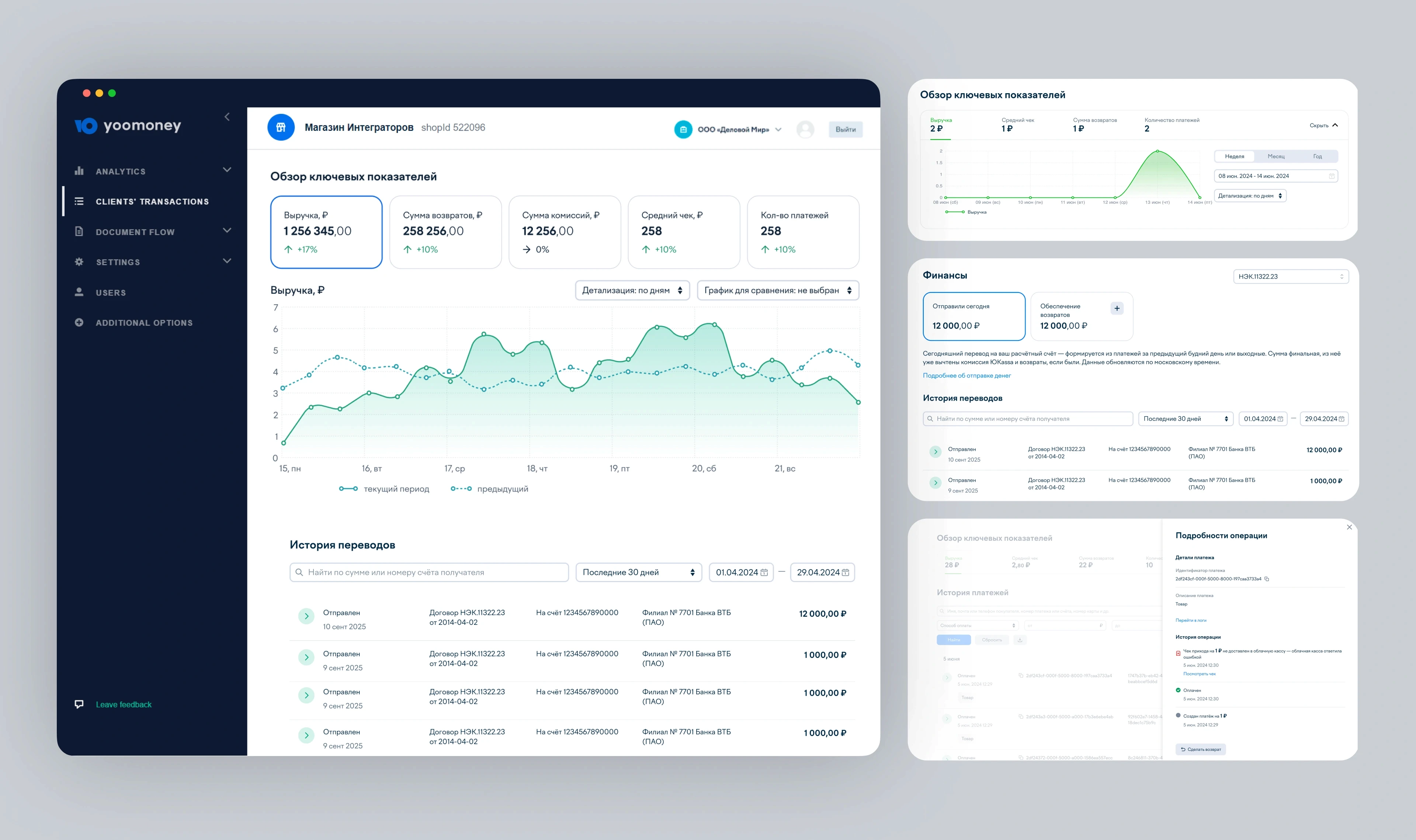
Key Metrics Dashboard
I designed a centralized dashboard that provides a clear overview of essential financial indicators. The interface highlights core metrics such as revenue, refund amounts, commission totals, and average transaction values. I focused on creating a clean, high-contrast layout where data remains the primary focus. The dashboard features interactive charts with a comparative analysis tool (current vs. previous period), allowing users to track performance trends at a glance. Directly below the analytics, I integrated a detailed transaction history with date filters and search functionality, making the management of financial records straightforward and efficient.
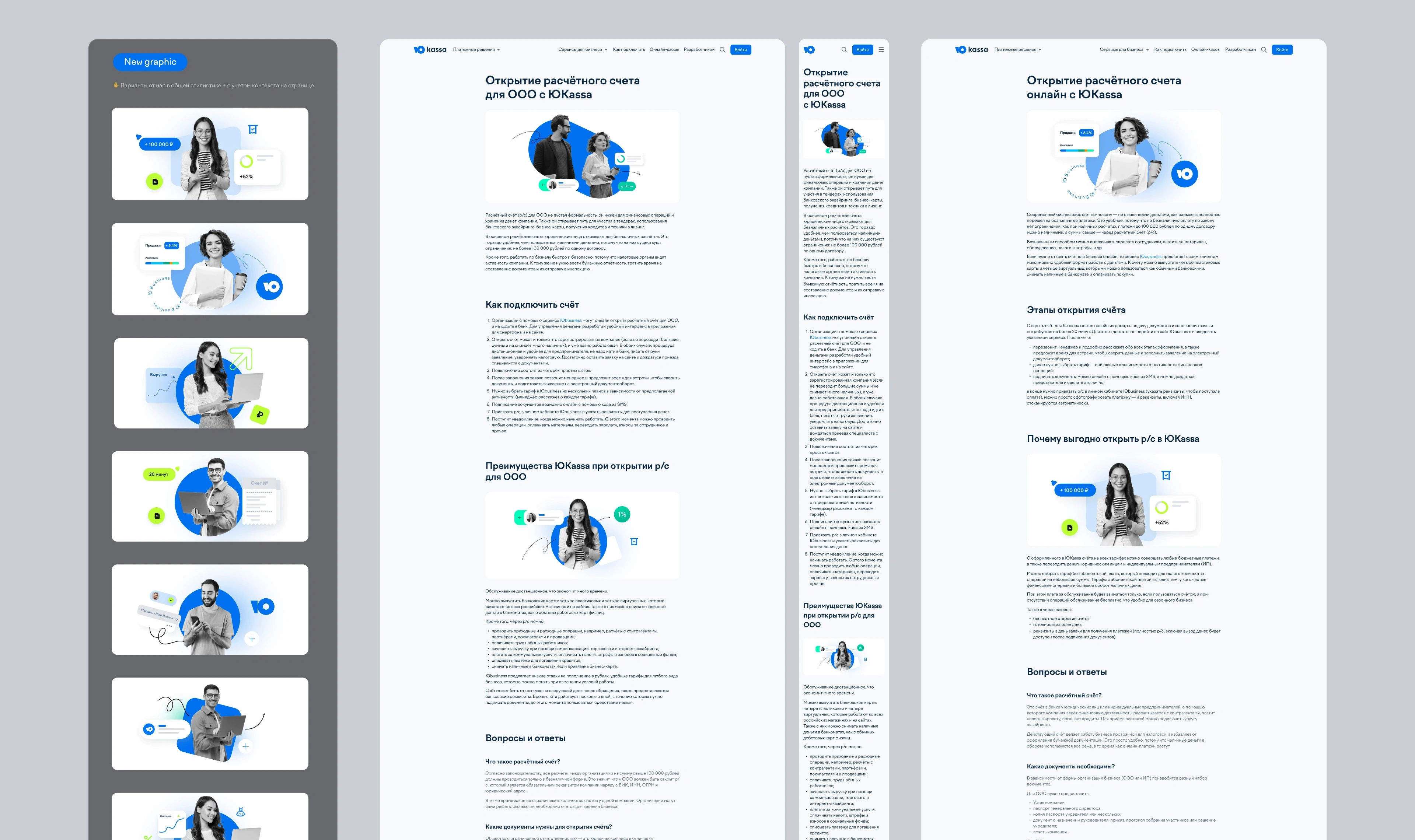
Content UI Kit and Article Templates
To support the platform’s educational initiatives, I developed a robust UI Kit specifically for long-form content and business guides. I created a set of modular blocks, typography styles, and custom graphic templates. A key part of this was the «Graphics Variants» library — a system of illustrative and data components that allow the team to visualize concepts like «Opening a bank account» or «Cashback benefits» consistently. These templates ensure that even complex, text-heavy articles remain engaging and easy to navigate on both desktop and mobile devices.
Key Solutions
Hierarchical Data Visualization
I implemented a clear information hierarchy in the dashboard, separating high-level metrics from granular operational data. By using a consistent color-coding system for positive and negative trends, I ensured that merchants can assess their business status in seconds. The interactive charts were designed to be responsive and performant, even when handling large datasets.
Scalable Graphic Language
The UI Kit I developed moved the content team away from one-off designs to a systematic approach. I created a library of flexible graphic components that combine photography with clean, branded UI elements. This not only improved the speed of content production but also significantly raised the overall aesthetic quality of the platform’s business-start pages and educational resources.
Results
The project resulted in a significantly more professional and functional environment for YooMoney’s B2B clients. The new dashboard design simplified the daily routine of merchants, providing them with the clarity needed for data-driven decisions. Meanwhile, the unified UI Kit for articles established a premium and trustworthy look across all informational touchpoints. By bridging the gap between functional financial tools and high-quality content design, I helped strengthen YooMoney’s position as a user-friendly and authoritative partner for businesses of all sizes.
Overview
YooMoney (formerly Yandex.Money) is a major player in the digital payments market. My work focused on enhancing the B2B experience within the YooMoney ecosystem. I designed a comprehensive merchant dashboard for tracking business performance and developed a modular UI Kit for the platform’s educational and informational content. The goal was to make complex financial data accessible and create a unified visual language for all business-facing communications.
My role
As a Product Designer, I was responsible for the UX and UI of the merchant’s analytical tools and the standardisation of the platform's content design. I worked on architecting the data visualization logic for the dashboard and created a scalable library of UI components and graphics for the service’s articles and landing pages.
The Challenge
The main challenge was to present high-density financial information without overwhelming the user. The dashboard needed to provide a clear «at-a-glance» view of business health while allowing for deep dives into transaction history. Additionally, the content team needed a flexible system to create high-quality articles and guides that maintain brand consistency while presenting complex data through simple, intuitive graphics.
The Ecosystem
Key Metrics Dashboard
I designed a centralized dashboard that provides a clear overview of essential financial indicators. The interface highlights core metrics such as revenue, refund amounts, commission totals, and average transaction values. I focused on creating a clean, high-contrast layout where data remains the primary focus. The dashboard features interactive charts with a comparative analysis tool (current vs. previous period), allowing users to track performance trends at a glance. Directly below the analytics, I integrated a detailed transaction history with date filters and search functionality, making the management of financial records straightforward and efficient.
Content UI Kit and Article Templates
To support the platform’s educational initiatives, I developed a robust UI Kit specifically for long-form content and business guides. I created a set of modular blocks, typography styles, and custom graphic templates. A key part of this was the «Graphics Variants» library — a system of illustrative and data components that allow the team to visualize concepts like «Opening a bank account» or «Cashback benefits» consistently. These templates ensure that even complex, text-heavy articles remain engaging and easy to navigate on both desktop and mobile devices.
Key Solutions
Hierarchical Data Visualization
I implemented a clear information hierarchy in the dashboard, separating high-level metrics from granular operational data. By using a consistent color-coding system for positive and negative trends, I ensured that merchants can assess their business status in seconds. The interactive charts were designed to be responsive and performant, even when handling large datasets.
Scalable Graphic Language
The UI Kit I developed moved the content team away from one-off designs to a systematic approach. I created a library of flexible graphic components that combine photography with clean, branded UI elements. This not only improved the speed of content production but also significantly raised the overall aesthetic quality of the platform’s business-start pages and educational resources.
Results
The project resulted in a significantly more professional and functional environment for YooMoney’s B2B clients. The new dashboard design simplified the daily routine of merchants, providing them with the clarity needed for data-driven decisions. Meanwhile, the unified UI Kit for articles established a premium and trustworthy look across all informational touchpoints. By bridging the gap between functional financial tools and high-quality content design, I helped strengthen YooMoney’s position as a user-friendly and authoritative partner for businesses of all sizes.
Kirill Kuchma
Product Designer
Thanks for visiting
Thanks for visiting
Thanks for visiting